

JobDone brand guidelines · current version: jobdone.app/resources/media
Press & brand
Everything you need to feature JobDone.
Logos, colours, typography, images and boilerplate copy for press, partners and everyone who shows JobDone – with the rules for using the brand the way we do.
Logo
The wordmark is the logo. It is a fixed graphic: always use the original files and never re-set the name in a font.
 Primary: blue on whiteDownload SVG
 Reversed: white on blue or night blueDownload SVG
 Single colour: night blueDownload SVG
Clear space and minimum size
Keep a clear space around the wordmark, free of text, images and page edges. More space is always fine.
xxxxMinimum size
Screen: 100 px wide
Print: 25 mm wide
Please don't
The logo only works if it looks the same everywhere. These changes are not allowed.
- Wrong: DistortingAlways scale proportionally.
- Wrong: RecolouringBlue, white or night blue only.
- Wrong: Adding effectsNo shadows, outlines or gradients.
- Wrong: RotatingThe wordmark is always horizontal.
- Wrong: Busy backgroundOnly on calm, single-colour areas.
- Wrong: Too little contrastUse the white version on dark areas.
- Wrong: Re-typingNever rebuild the wordmark with a font.
- Wrong: In running textWrite the name as text in a sentence. Titles can use the wordmark.
Mark and app icon
The mark complements the wordmark where space is tight – only on JobDone Blue or Night Blue, never on light backgrounds. When the name is not next to it, use the app icon.







Colours
JobDone Blue is the brand colour; Night Blue carries the text. JobDone feels bright, calm and tidy.
- JobDone Blue#206AE9RGB 32 · 106 · 233
- Night Blue#16243DRGB 22 · 36 · 61
- White#FFFFFFRGB 255 · 255 · 255
- Dark blue #1458CC
- Pale blue #DAECFF
- Light blue #ECF6FF
- Light grey #F5F7FA
- Line #DADDE4
- Grey #7F8897
- Slate #5C627A
Weighting (guideline)
- White and light grey · 60 %
- Night blue · 25 %
- Blue · 15 %
Blue sets deliberate accents: logo, buttons, links and key figures.
Contrast for text (WCAG 2.1)
| Combination | Ratio | Use |
|---|---|---|
| Night blue on white | 15.5 : 1 | Body text |
| Slate on white | 6.0 : 1 | Body text |
| White on JobDone Blue | 4.9 : 1 | Buttons, text |
| JobDone Blue on white | 4.9 : 1 | Links, text |
| Grey on white | 3.6 : 1 | Large text only |
| Blue on night blue | 3.2 : 1 | Not for text |
Feature colours
They mark the five product areas and only help orientation, for example in icons or labels. They are not brand colours.
- Scheduling #F64DD1
- Time tracking #0E956F
- Communication #1FA5FF
- Payroll #F26A02
- Integrations #641DD8
- At most one accent colour per area.
- No gradients made of brand colours.
- The logo stays blue, white or night blue, even next to feature colours.
Typography
Manrope is JobDone's typeface for headings, body copy and interface elements. It is freely available (SIL Open Font License).
Where Manrope is not available, for example in e-mails or Office templates, use Arial. In your own layouts you may use your own typeface.
Manrope on Google Fonts ↗Product images
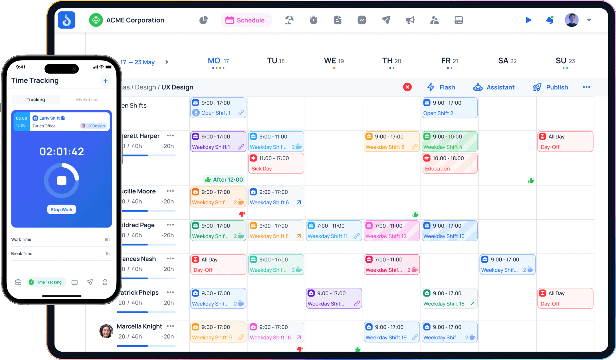
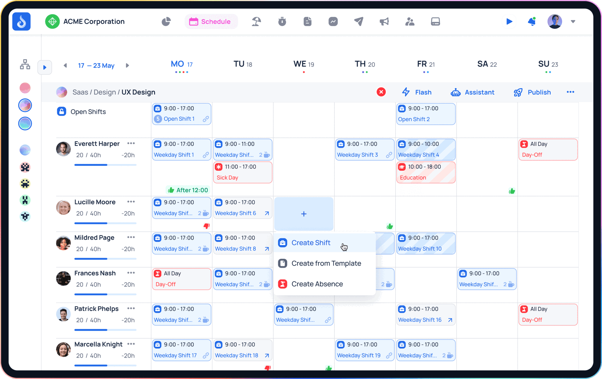
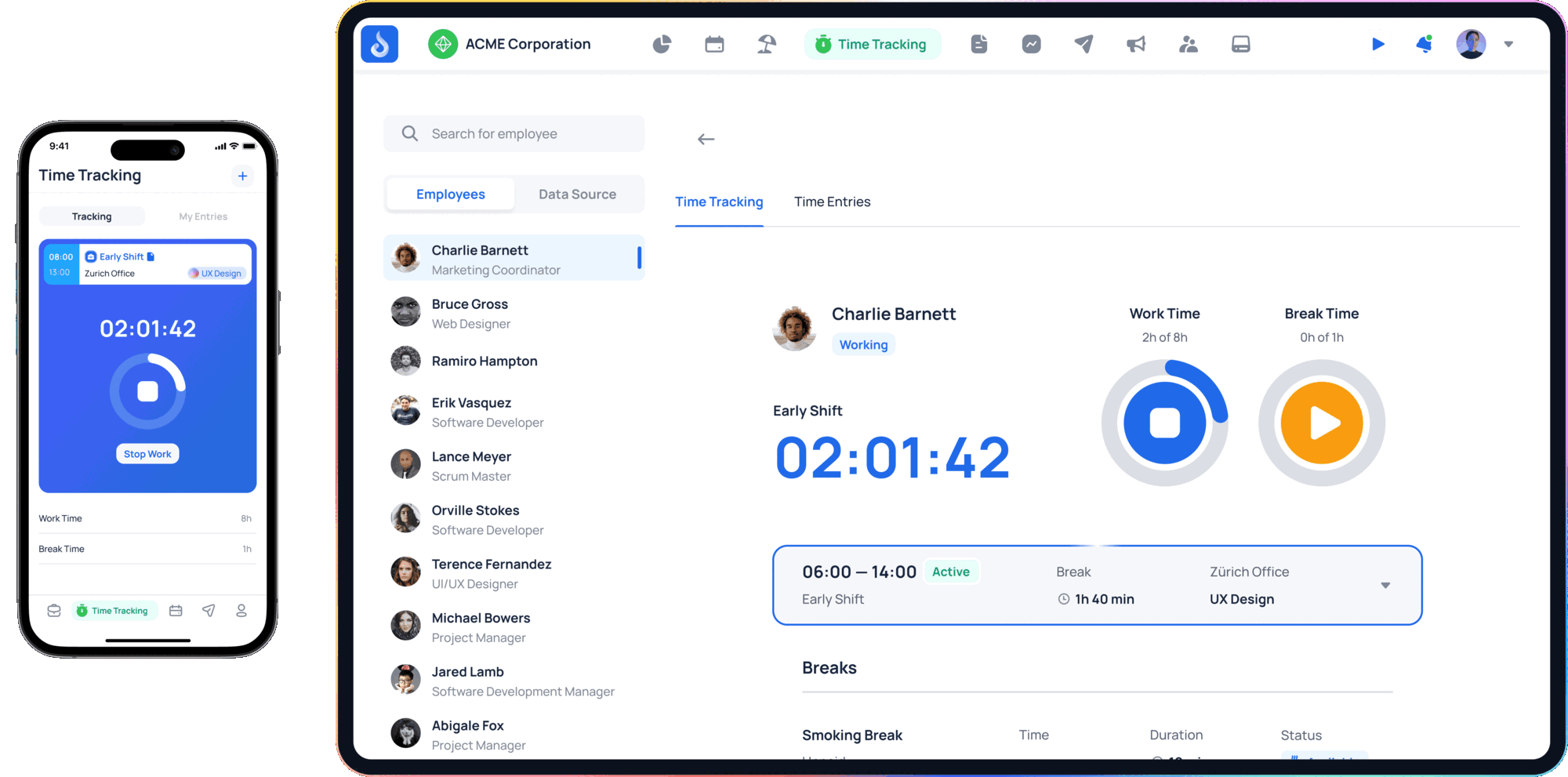
The product speaks for itself. Please scale proportionally, place on light, calm backgrounds and do not alter the images. They show demo data.
 Scheduling and mobile time trackingDownload PNG
 SchedulingDownload PNG
 Time trackingDownload PNG
Founders and team
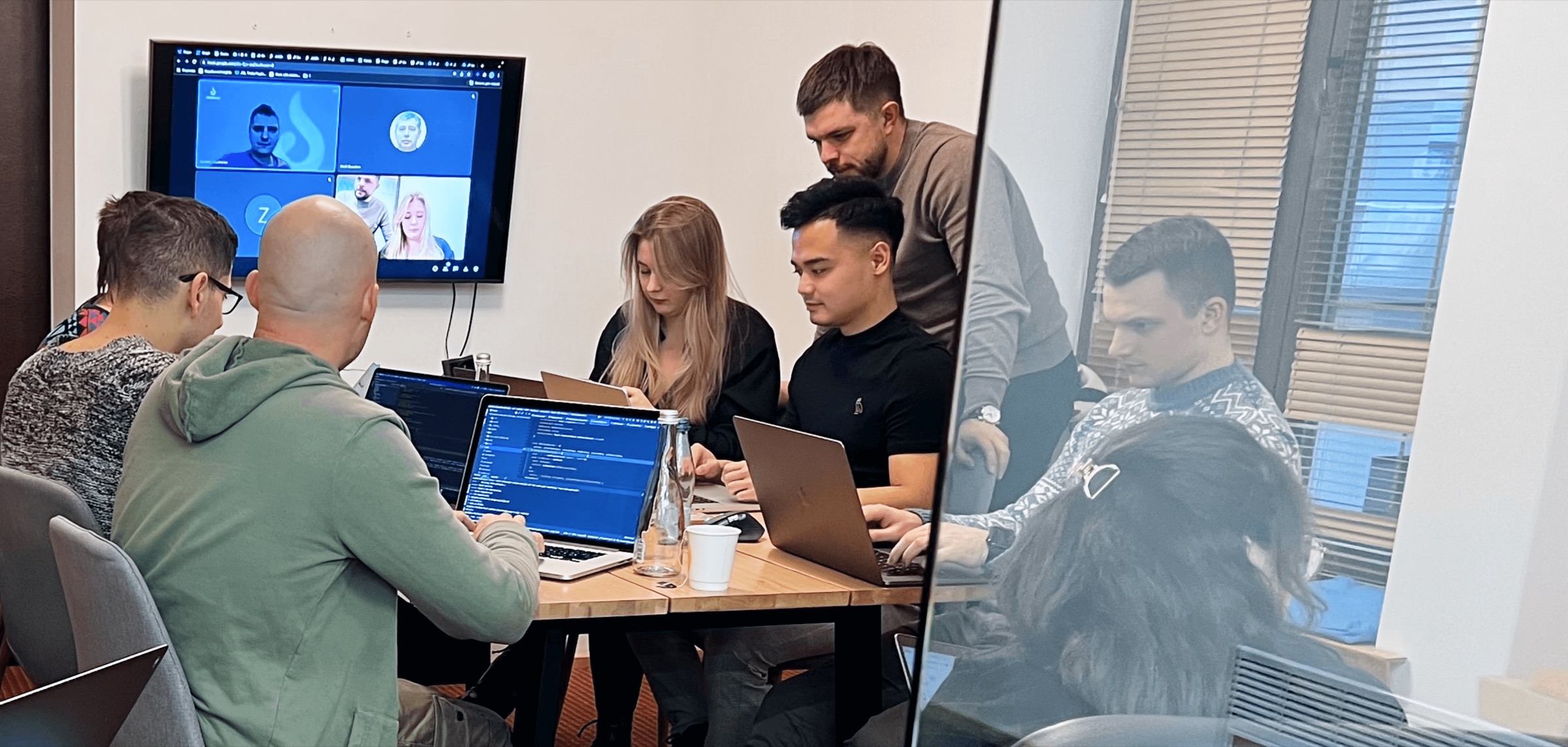
Photos for articles and profiles. Please use them unaltered and in connection with JobDone.
 Lucky Bassi · Co-Founder & CEODownload JPG
 Samuel Brun · Co-Founder & COODownload JPG
 JobDone Team · Team in ZugDownload JPG


Co-branding
When JobDone and your brand appear together, both logos stand side by side as equals, separated by a thin line.
- Space between each logo and the line: one wordmark height (h).
- Line: twice the wordmark height, 1 px or 0.5 pt, in Line #DADDE4.
- Both logos optically the same size and centred. Whoever publishes stands on the left.
In text
- “[Your brand] and JobDone” or “[Your brand] × JobDone” for joint offers.
- “Integration with JobDone” for technical connections.
- “JobDone Partner” only with a valid partner agreement.
Not allowed
- Merging the logos into a new symbol.
- Using the JobDone mark or app icon as your own icon.
- Implying an endorsement or certification that has not been agreed.
- Including JobDone in domain or product names.
Boilerplate
Ready to use in articles, websites and presentations.
JobDone is next-generation workforce management: scheduling, time tracking and team communication in one app.
JobDone is next-generation workforce management software. Businesses use it to build shift schedules, track working time, communicate with their teams and prepare payroll – all on one platform, on the web and in the app. JobDone AI supports scheduling by taking time balances, availability, preferences and skills into account.
JobDone AG, based in Zug, Switzerland, was founded in 2018 by Lucky Bassi and Samuel Brun. Its platform brings together scheduling, time tracking, communication and payroll, and connects to HR, point-of-sale and analytics systems through integrations. Businesses in gastronomy, hospitality, events, healthcare, retail and logistics organize their teams with JobDone.
Before you publish
✓ JobDone✕ Jobdone · Job Done · JOBDONE · JD
- The name is written as JobDone everywhere: one word, capital J and capital D.
- The original wordmark is used and unchanged.
- Clear space respected, at least 25 mm or 100 px wide.
- Logo on a calm background with enough contrast.
- Colours from the JobDone palette, only provided images without edits.
- Copy is factually correct, with no promises that have not been agreed.
- Material with the logo or product images approved by JobDone.
Company
- Company
- JobDone AG
- Founded
- 2018
- Headquarters
- Zug, Switzerland
- Website
- jobdone.app
Press, questions and approvals
Send us drafts that use the JobDone logo or product images before publishing. We are happy to help with other formats.